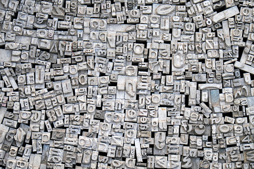
Typography is like an invisible art form. If successful, good typography could be compared to the frame of a picture, lending itself to supporting the picture, NOT overtaking or distracting from the art. Typography exists to make the words, logos, graphics, pictures... and their meaning the focus and not a distraction. Of course, misspelled words are always a no no, as we discussed in detail in last month’s blog.
BUT - typography is more than getting the words spelled correctly. So - what is it and why does it matter?
Simply put, typography is a creative art form used in web design (used for logos, marketing phrases, creating consistency throughout website pages) that determine the meaning beyond the text. This includes font selections, stylized aspects like letter design, leading, kerning and more. It could be compared to body language. When a good communicator is speaking, his body language matches and compliments what is being said. Sometimes it’s the body language that speaks louder than words.
Typography serves many purposes. First of all, the words have to be understood and legible. The goal is to evoke an emotion that is always the same when it comes to your brand identity. A good logo is a good example - which can cause a positive (or sometimes negative) thought or response - something visually pleasing to the eye. Pairing fonts correctly can also make your website more dynamic, holding the reader’s attention without causing a distraction.
Typography has several elements as well, which include fonts, typeface, type size, alignment and more. One of the elements is alignment - which refers to the arrangement of the text body edges. This includes left, center, right and justified alignment options. Left is the most commonly used alignment. When aligning the text of the body, line length must be a consideration, as well as the space between the words or even letters - all combining to create a balanced line that is easier to read.
Image source: https://cxl.com/blog/the-effects-of-typography-on-user-experience-conversions/
This may seem like a bunch of petty details, but it is a proven fact that good typography produces repeat visitors to your website. The more they visit, the more successful and profitable your business will be!
Since fonts are the foundation of good typography, they are usually broken down into three categories:
Serif: typefaces with characters having slight projections finishing off the end of a stroke. Times New Roman is a serif font.
Sans-serif: very clean characters that are uniform, but do not display the distinguishing marks of the serif font. Arial and Helvetica are sans-serif fonts.
Calligraphy: Fonts that fall into this category are Gothic or Blackletter. These fonts look like they’ve been handwritten with an inkpen.
In the culinary world, negative plating is often a method used to draw more attention to the entree. The same could be said of “white space” in typography. This is the “negative space” around the text or graphics. Properly used, white space ensures everything is readable and uncluttered. The goal is to draw attention to the text, providing a visually-pleasing experience. White space usually takes the forms of margins, padding, even areas where there is no text or graphics.
As you can tell, there’s more to creating a good website than meets the eye. Hiring professionals takes the headache off of you and allows you to focus on growing your company. Your website should serve as a helping hand to you, not a thorn in your side.
Simply put - we build websites that work! You would be surprised at how affordable we are - and you will be pleasantly pleased with the end result. Please visit our ONLINE PORTFOLIO to see for yourself the quality website designs we have built for others. If the DIY isn’t going as planned, or if you just want to discuss options, give VisionAmp Web Design a call today at 870.580.0909.
