Have you ever been around people who overshare? This happens all of the time on social media platforms. While it’s nice to post life updates, opinions and encouraging words, oversharing usually results in being blocked or snoozed. In today’s world, too much information, even on a website, can be detrimental.
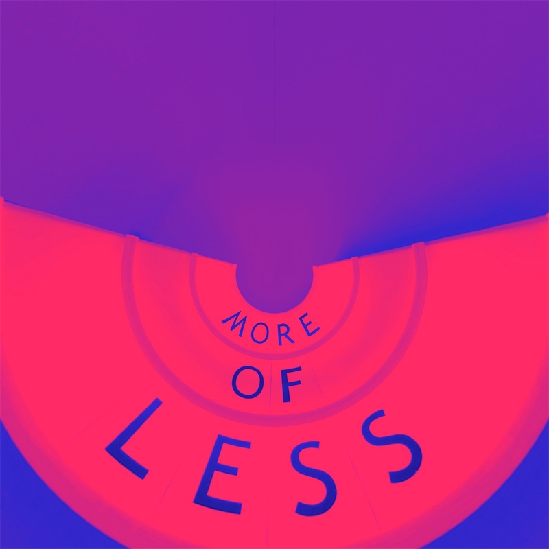
Here are some reasons why your website needs more of less:
When someone lands on your website, you have mere seconds to capture their attention. The average online attention span ranges from 6 to 20 seconds, depending on the source. It only takes about 50 milliseconds (.05 seconds) for users to determine their opinion about your site. Most people only read an average of 28 percent of the words on a web page. If they are immediately bombarded with info overload they will leave. This is a fact. When your site is built, short attention span tendencies have to be considered for each and every page, every image, every paragraph, every word. EVERYTHING.
Too much content turns people away. While you want to communicate information, don’t give them a 10 minute essay on your landing pages. While there is a place for detailed, lengthy descriptions or explanations, these pages must be WAY down on the menu list - created for those who are wanting MORE. If you only let them drink from a fire hydrant they will not stay. Don’t overwhelm them and get to the point with precise and intentional information.
Slow websites. Been there - done that - wore the T-shirt and sold it at a garage sale. Slow is not good when it comes to your site. Do you have non-optimized photos? Are you using wrong coding? Does the server you’re using have limitations? Do whatever you can to unclog the bottleneck and break the dam so the info can flow.
In the culinary world, negative plating is often a method used to draw more attention to the entree. The same could be said of “white space” on a website. This is the “negative space” around the text or graphics. Properly used, white space ensures everything is readable and uncluttered. The goal is to draw attention to the text, providing a visually-pleasing experience. White space usually takes the forms of margins, padding, even areas where there is no text or graphics.
This minimalist design mentality embraces ideas that include cutting out images and wordy menus, and instead, rely on a few choice lines of straightforward text.
If you are oversharing on your site you can KISS your customers goodbye. “Keep It Short Sweetheart” is a saying many communicators abide by. Saying less, leaving the audience wanting more is always the ticket! If your website is struggling, perhaps it’s time for an overhaul - or even a complete rebuild.
Give VisionAmp Web Design a call today at 855.862.5491. We do build websites that work! You would be surprised at how affordable we are - and you will be pleasantly pleased with the end result. Please visit our ONLINE PORTFOLIO to see for yourself the quality website designs we have built for others. Let us show you how more of less can work to your advantage!