Simply put, Responsive Web Design (RWD) is an approach that allows design and code to respond to the size of a device’s screen. Meaning it gives you the optimal viewing experience whether you’re looking at a 4-inch android mobile, your iPad mini or a 40-inch cinema display. RWD technology is a fancy way of saying that the website detects what device is viewing the webpage (smartphone, tablet, desktop computer...) and automatically adjusts the layout to conform to the size of the device that's being used. Pretty awesome!
If we designed and developed countless versions of a website that worked for every known device out there, the process just wouldn’t be practical time-wise and would be extremely costly! It would also render sites ineffective to future technology changes and make them nearly impossible to maintain. Responsive design is an effective solution to future-proof your website.
Approximately 56 percent of traffic in US websites is now from mobile devices. Today there are around 2.6 billion smartphone users, and by 2020 estimates are over 6 billion. Mobile design has never been more important.
Freaking out about designing for your website? Don’t worry! VisionAmp has been utilizing this technology for years! Staying current with technological trends, demands and upgrades is what we do best! It’s a constant battle to adapt design for all browser versions as well as hardware devices. According to the latest data from StatCounter, 1366 × 768 screens just surpassed 1024 × 768 as the most popular screen resolution used by the visitors to StatCounter’s global network of sites. Change happens!
Technology and the expansion of mobile websites are pushing web designers to re-think how their work is displayed across various devices. Think about it: how much browsing do you do every day on your phone vs. your desktop?
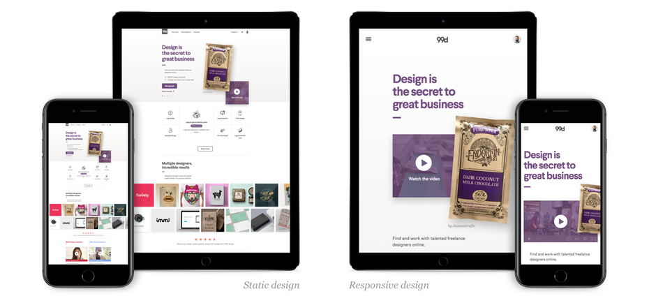
Responsive design can help you solve a lot of problems for your website. It will make your site mobile-friendly, improve the way it looks on devices with both large and small screens, and increase the amount of time that visitors spend on your site. It can also help you improve your rankings in search engines. By allowing VisionAmp to design your next website, you can rest assured that you will have a cutting-edge site that utilizes the most current technology tools. Don't get stuck in the past with a static website - where the user has to zoom in and out to view content. Responsive is the way to go! Here is an example of static vs. responsive web design:
VisionAmp custom designs and builds every single website. We take the time necessary (and it takes a LOT of time, actually. On average, our sites take 60-80 hours to build) to create a fully responsive site that works great on all browsers and represents your business the best way possible on any device! It’s critical to design your website for varying devices, but it gets more complicated when designing across varying web browsers. Each major web browser has its own mobile version and renders sites differently.
Check out our portfolio and see for yourself how our websites are easy to use, easy to read, have a great flow - AND how the content responds to fit any platform you are viewing with. And then...call us when you’re ready for a fully responsive website to take your business to the next level.